Hi,
Follow below steps:
1. Create a bar chart sales and profit over month over a region.
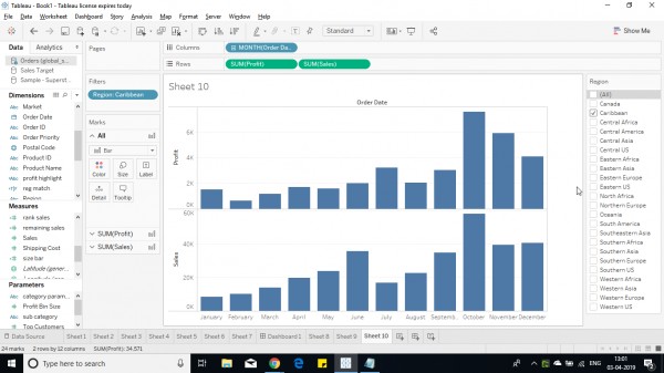
2. Now convert the sales, profit to avg measure.
3. Convert into running total from quick table calculation.
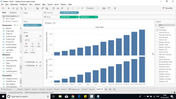
4. Now convert the bar to gantt under marks pane.
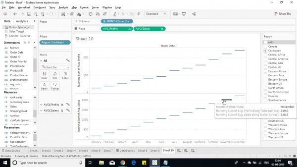
5. Create 2 calculated field with values of -avg(sales) and -avg(profit) to provide the size of bar.
6. Now add both field to respective panes.
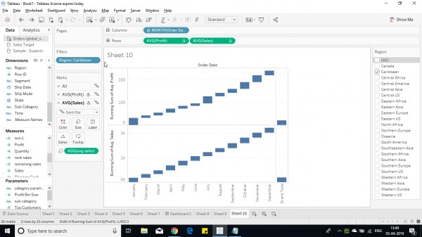
7. Now add sales and profit to color section.
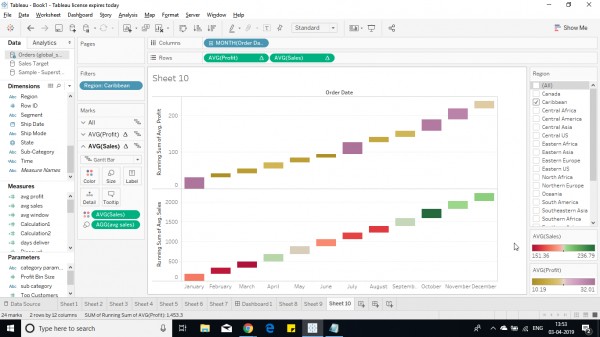
A running average for profit and sales are shown as above, where color shows increase/decrease details.
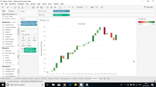
The above similar chart for day based on a month would look like this to show profit or loss better way.
Hope this helps you.
 REGISTER FOR FREE WEBINAR
X
 Thank you for registering
Join Edureka Meetup community for 100+ Free Webinars each month
JOIN MEETUP GROUP