Hi Sindhu,
1.You can use average lines to show multiple aggregation values.
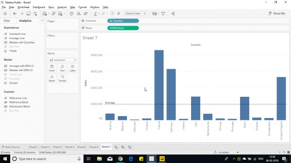
2. Plot a bar graph as per requirement, then click on analysis pane.
3. Drag and drop average line across Pane / Cell / Table.

4. If there ate multiple panes then go for pane to show aggregations of individual panes else select table to show aggregation of complete table.
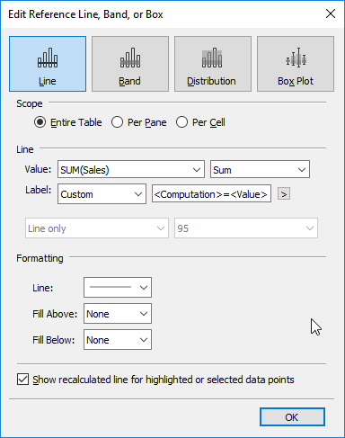
5.Right click on the line to edit the line.
6. Edit the dialog box as per requirement.

7. Edit the labels as required and click ok.
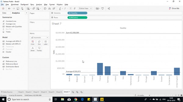
8. Create multiple lines to show each aggregation by editing the lines as above by selecting different aggregation functions from drop down.
This way multiple aggregated values can be shown in a bar chart.

Hope this helps you.
 REGISTER FOR FREE WEBINAR
X
 Thank you for registering
Join Edureka Meetup community for 100+ Free Webinars each month
JOIN MEETUP GROUP