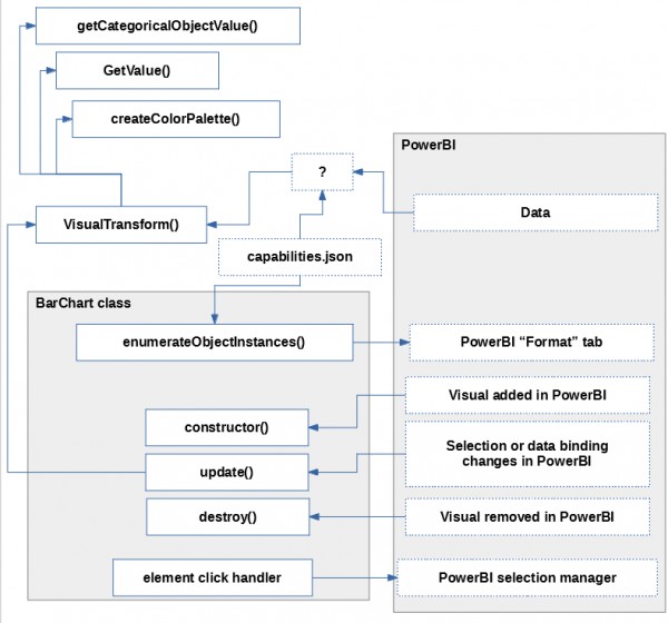
I hope I'm not asking too much, but could someone, using this bar chart as an example, post a sequence of which methods in the visual source are called (and how the data is converted and passed) when:
-
The visual is added to the dashboard in PowerBI,
-
A category and a measure are assigned to the visual,
-
Data filter in PowerBI changes,
-
An element on our custom visual is selected.
-
Your option which you think may be relevant
I used this specific visual as an example because it was mentioned as meeting minimum requirements for contributing a new custom visual, which sounds like a good starting point, source:
New Visual Development
Please follow our minimum requirements for implementing a new visual. See the wiki here.
(the link references the bar chart tutorial)
However, if you have a better example visual - please use that instead.
This is all I got:

 REGISTER FOR FREE WEBINAR
X
 Thank you for registering
Join Edureka Meetup community for 100+ Free Webinars each month
JOIN MEETUP GROUP