Aligning title in ggplot2

0 votes

I am working with the iris data-set to plot 'Sepal.Length vs Petal.Length'

ggplot(data=iris,aes(x=Sepal.Length,y=Petal.Length))+geom_point()+ggtitle("Sepal.Length vs Petal.Length")

Now, by default the title is left-aligned, how can I center align the title?

Apr 27, 2018 in Data Analytics by nirvana
• 3,130 points

edited Jun 9, 2020 by MD 3,809 views

1 answer to this question.

0 votes

You can use the theme layer to center align the title. Below is the command solves your problem:

ggplot(data=iris,aes(x=Sepal.Length,y=Petal.Length))+geom_point()+ggtitle("Sepal.Length vs Petal.Length")+theme(plot.title = element_text(hjust = 0.5))
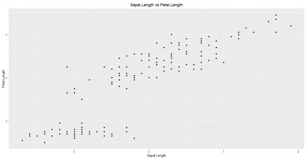
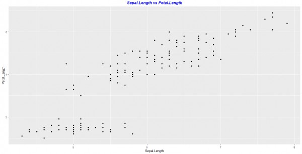
You can also change other parameters of the title such as font color and font style:

ggplot(data=iris,aes(x=Sepal.Length,y=Petal.Length))+geom_point()+ggtitle("Sepal.Length vs Petal.Length")+theme(plot.title = element_text(hjust = 0.5,colour = "blue",face = "bold.italic"))
answered Apr 27, 2018 by Bharani
• 4,660 points

edited Jun 9, 2020 by MD

Related Questions In Data Analytics

+1 vote
1 answer

How to change fill color in each facet using ggplot2?

You can map the facetting variable to ...READ MORE

answered May 8, 2018 in Data Analytics by kappa3010
• 2,090 points
25,611 views
0 votes
1 answer

How to stack scatterplot in ggplot2?

Use melt() to reshape your data with total as a factor ...READ MORE

answered May 8, 2018 in Data Analytics by Sahiti
• 6,370 points
2,544 views
0 votes
1 answer

How can I add x and y axis labels in ggplot2 ?

# Load a dataset(to work with) # We’ll ...READ MORE

answered May 16, 2018 in Data Analytics by zombie
• 3,790 points
1,104 views
0 votes
1 answer

How can I change font size and direction of axes text in ggplot2 ?

You can try theme(): Library(ggplot2) a <- data.frame(x=gl(10, 1, ...READ MORE

answered May 30, 2018 in Data Analytics by zombie
• 3,790 points
4,390 views
0 votes
1 answer

How to plot side-by-side Plots with ggplot2 in R?

By Using gridExtra library we can easily ...READ MORE

answered Apr 16, 2018 in Data Analytics by DeepCoder786
• 1,720 points

edited Jun 9, 2020 by MD 8,927 views
0 votes
1 answer

Showing percentage instead of counts in a bar plot - ggplot2 - R

Load the 'scales' package first, which gives ...READ MORE

answered May 29, 2018 in Data Analytics by Bharani
• 4,660 points
3,917 views
0 votes
1 answer

Making a ggplot2 plot without any legends,axes or axis labels

The below command will give you the ...READ MORE

answered May 29, 2018 in Data Analytics by Bharani
• 4,660 points
798 views
0 votes
1 answer

Removing outliers from a box-plot - ggplot2 - R

You just have to add 'outlier.shape=NA' inside ...READ MORE

answered May 31, 2018 in Data Analytics by Bharani
• 4,660 points
24,896 views
0 votes
11 answers

Changing the legend title in ggplot

Hi, you can also try guides() to ...READ MORE

answered Jul 30, 2019 in Data Analytics by Cherukuri
• 33,030 points
17,834 views
0 votes
1 answer

Changing the order of bars in a bar-plot - ggplot2 - R

You can use the scale_x_discrete() function with ...READ MORE

answered May 28, 2018 in Data Analytics by Bharani
• 4,660 points
9,769 views
webinar REGISTER FOR FREE WEBINAR X
REGISTER NOW
webinar_success Thank you for registering Join Edureka Meetup community for 100+ Free Webinars each month JOIN MEETUP GROUP